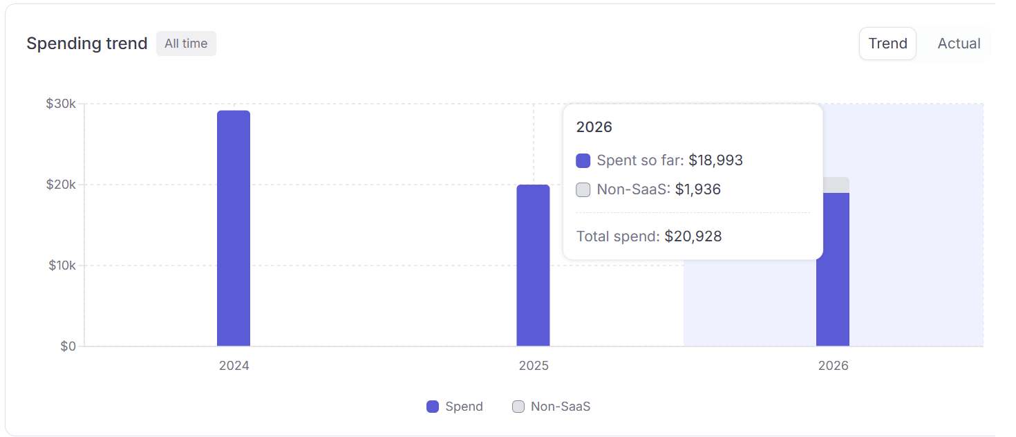
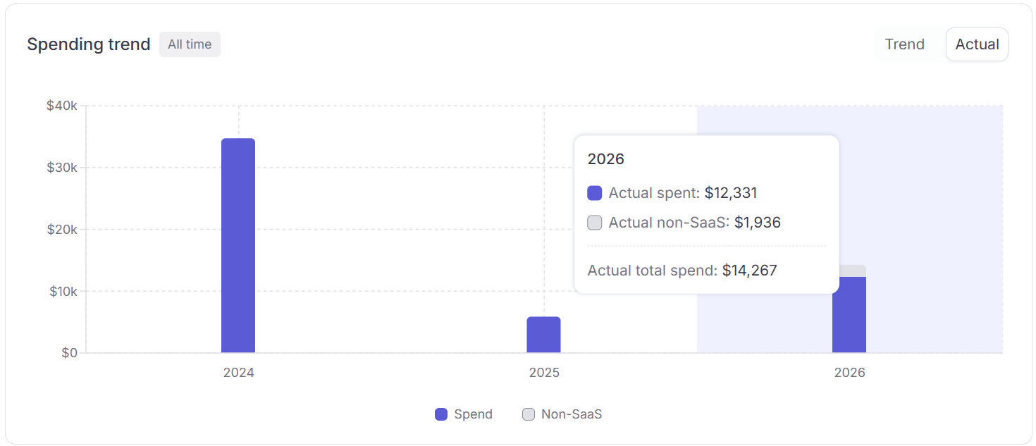
The Spending Trend chart sits below the KPI cards and shows bar-chart spend per calendar month. Use it to track budget trajectory and spot anomalies.

Two view modes

TabWhat it shows
TrendSpend normalized across time: yearly subscriptions are divided equally across 12 months so the chart shows a smooth monthly average. Good for spotting long-term patterns without big one-off spikes. Projected spend for future months is shown in a lighter, hatched style.
Actual SpendSpend posted on the exact date the charge occurred. A 120/yearsubscriptionappearsasasingle120/year subscription appears as a single 120 bar in the month it was charged, not as $10/month. Use this view to match charges to your actual card statements.
Spending trend: Trend tab
Spending trend: Actual Spend tab

Non-SaaS

Each bar stacks SaaS spend (purple) with a grey segment for Others category charges — travel, hardware, and other non-software spend. The grey portion appears automatically when those charges exist. Non-SaaS amounts are excluded from KPI cards and SaaS totals, but still show on the chart. See SaaS spend vs. Non-SaaS spend for how categories affect your totals.

Date window

The chart respects the date filter in the dashboard top-right. Changing it rescopes all KPIs, the trend chart, and widgets simultaneously.